
Abigail Yarrison, Staff Writer
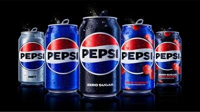
If you’ve bought a Pepsi recently you may have noticed something odd. Maybe you were looking for that soft blue can and passed right over it, only to do a double take. Is that Pepsi? Yes, it certainly is. In March, Pepsi released its first rebrand in 14 years, taking it back to the 90s.
Todd Kaplan, PepsiCo’s Chief Marketing Officer, told CNN that the current logo did not align with Pepsi’s brand identity. “Pepsi is a bold and confident brand,” Kaplan said, and the soft lowercase lettering, muted blue, and thinly outlined circle represented a more timid Pepsi. Additionally, when Pepsi did a consumer pool, “How would you draw the Pepsi logo from memory?,” customers and employees alike drew a circle, red, white, and blue stripes, and the central PEPSI inside. Pepsi’s rebrand acknowledged that the modern logo, though aesthetically pleasing, was not Pepsi. Brand identity is all about recognition. A company needs a logo that is recognizable to the consumer.
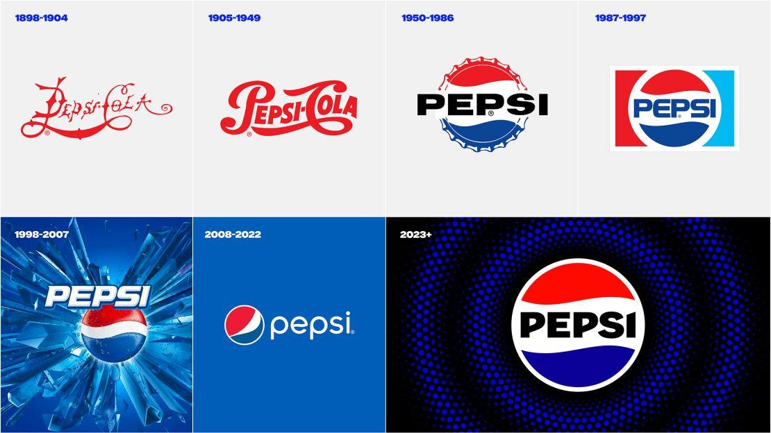
Image source: CNN Business
To reinvent the logo, Pepsi looked back on their 125 year history. The iconic “yin and yang” logo was used from 1987-1997 and was the inspiration for the rebrand. Pepsi brought back the classic circle with the brand name front and center, displayed in a modern typeface. The font was a customized version of the Adobe Owners font with “the right balance between nodding to a familiar look and feel on one side, and projecting the unapologetic energy and dynamism of the brand on the other,” says Mauro Porcini, PepsiCo’s Chief Design Officer. Pepsi introduces electric blue as the blue stripe of the circle to emphasize the boldness of the brand.
Pepsi also introduced the color black to their palette as a nod to Pepsi Zero Sugar cans. Pepsi Zero Sugar “is going to be the center of the strategy for the Pepsi brand,” in the US, PepsiCo (PEP) CEO Ramon Laguarta said during a February analyst call. Pepsi recently made a change to their zero sugar recipe. Customers said it tastes sweeter, more like real cola, and without the strange aftertaste it used to have. Many soda brands have focused on providing customers with low or zero sugar varieties. Making black a central color shows their dedication to offering zero sugar soda.
Pepsi’s rebrand went far beyond a logo alteration and can color-change. Pepsi rebranded their visual identity as well. In an increasing digital world, Pepsi has created a digital brand which includes “animated pulse,” which Porcini describes as “a living and breathing design asset.” The pulse recalls the “ripple, pop, and fizz” of Pepsi-Cola and can be used digitally in video and advertising as well as for the background of social media posts. Upbeat and energetic music is also a new part of their digital identity. Check out this video of their brand announcement to get a glimpse of their digital identity: https://www.youtube.com/watch?v=UZZ5s_qhHMA&t=30s
“This new visual system brings out the best of the Pepsi brand’s rich heritage, while taking a giant leap forward to set it up for success in an increasingly digital world,” says Kaplan. The design team excelled at combining the iconic 90s design with a modern feel. “We couldn’t be more excited to begin a new era for Pepsi,” Kaplan continued, “as this exciting new and modern look will drive brand distinction to show up bigger and bolder and help people find new ways to unapologetically enjoy the things they love.”


