
Ryan Pringle ’25, Staff Writer

On Thursday, April 20th, a group of talented students at Immaculata University got together to set up a gallery showcasing the splendid artistic work they had crafted, much of which while attending IU. While there, I had the opportunity to observe and photograph some of the pieces on display. And after the event, I also managed to snag an interview with one of the artists involved in this production.
Superb, Splendid, and Sublime:
I entered into the faculty center lounge just a few short minutes after the clock struck six. Accompanying me was the first batch of attendees for this art gallery, and once we were beyond the constricting doorways the room opened up into a sea of splendor. I was warmly received by the hosts and immediately went about my business drinking in all the sights before my eyes. Of course, I was immediately drawn to the display by the entrance, which featured two pieces of art done by Toni Milani and Nick Schneider respectively, both of whom were present to direct guests and answer questions.
Toni’s artwork practically leaped out at me, and I was struck by just how effectively she managed to portray her ideas. Her piece depicted a green jug, just like any you might find in an old kitchen, placed upon a background. The artwork was made of various pieces of paper glued together, and displays a surprising amount of cohesion in spite of that fact. The different shades of green, some light and some dark, alongside the varying widths of the paper slices, forms a very believable shape for the jug. On top of that, the background is made of newspaper clippings, which helps add a halcyon charm to the artwork as a whole.
Nick’s piece is far simpler in its composition, though no less visually intriguing. The artwork evokes the imagery of playing cards, featuring white diamonds, spades, clovers, and hearts within a foggy black background. I asked Nick how he made this particular piece, and he told me that he used Styrofoam cutouts to make the shapes, which allows for softer edges compared to paper, and spraypainted the black background.
A Vast Expanse of Styles:

After browsing for a bit, I couldn’t help but treat myself to some of the snacks and refreshments offered. The cheese and crackers were of the fancier variety, and quite delectable if I do say so myself. I also managed to grab one of the delicious chocolate chip cookies from Wegmans before they were all gone.
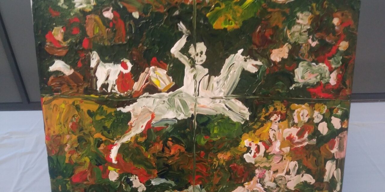
After I had filled my stomach, I began to fill my mind with thoughts about the artwork on display. I did another round of walking about the gallery and laid my eyes on some of the pieces I hadn’t noticed before. One particular piece, this one also by Toni, stood out to me. According to the description provided, it was intended to be a copy of the painting “The Triumph of Death,” by Cecily Brown. Indeed, after taking a gander at the original work, I can say that Toni succeeded in replicating the general style and shape of Brown’s painting. Obviously, this version is not nearly as detailed as the original, however, I feel that the more simplistic style provides its own sort of charm.
Beyond the Canvas:

Of course, this was an art show, not just a painting and drawing show, so there were pieces representing a larger array of media, including ceramics. I personally found this small section of the gallery to be one of my favorites, and I was quite impressed by the ceramic works that were on display. One piece of artwork that caught my attention in particular was “Honey Pot” by Annie Daly. This colorful little ceramic pot immediately brought back memories from when I was very young, and loved to watch everything related to Winnie-the-Pooh. Annie managed to perfectly capture the cartoonish charm of that beloved childhood story, and crafted a pot that I think even Pooh Bear himself would mistake for one of his own!
An Interview with Skye Dreng Hamrell:

Ryan: I heard that you made this particular piece at an art school in Norway. Tell me a bit about your experience there, and the kind of artwork you created.
Skye: My parents are from Norway, and I have spent a lot of time between there, Virginia, and now Pennsylvania. After graduating high school and before I came to IU, I spent a year at the Sandefjord Folkehøyskole school in Norway. Although that school does offer other classes besides just art, I call it an art school because I got to focus solely on drawing and painting while I was attending there. It was similar to college in some sense because I lived on campus in the dorms. But unlike here, we did not get formal grades and we were instead scored based off participation. However, I still learned important techniques for art. While there I got to do projects with various mediums, and this particular work was a mixed media piece. Almost every week we had a new project, and I created about 20 total, plus lots of practice sketches for anatomy. I made this particular piece in September 2020, only a month into the school year.
Ryan: There is a lot going on in this piece; could you maybe explain what the artwork is meant to portray?
Skye: For this assignment we were told to pick song lyrics, and I picked lyrics from the song “Chamber of Reflection” by Mac DeMarco. It is a relaxing and calming song, with a lot of lyrics that relate to mental health. In this sense, you could see my artwork as representing mental health, as the woman is inside her own head and looking upon the outside world which is so much brighter. The flower is colorful but dimming, which represents how our mind can influence our perceptions of the world.
Ryan: The piece makes me feel somewhat introspective. Was that one of the reactions you intended this piece to evoke?
Skye: Yes, especially considering the meaning of the song! I tried to represent the song very closely in my art, and I think I was successful. Some people have given me different interpretations, but that was indeed how I intended it.
Ryan: Tell me a bit about the process involved in creating this piece.
Skye: I started off with a rough sketch of the woman, and so I looked at references to get the right pose. I wanted her to be sitting, and finding the right leg position in a model was difficult. I used white pastel on a background of black construction paper, since it is supposed to be a mixed medium piece. I had to draw shadows based on the light source of the window, which is supposed to make the picture seem less flat. However, I actually did the shadows before I added the window. The penultimate step was to cut out a piece of painted watercolor for the window and paste it onto the construction paper. And finally, I added lyrics from the song.
Ryan: Were you inspired by any preexisting artwork?
Skye: It was less style and more observation. My artwork tends to be more cartoonish and less realistic. I stuck fairly close to the model I used.
Ryan: How has your artwork changed since this piece?
Skye: I haven’t drawn as intensely since my time at that school. However, I still participate in an event called Inktober, where we have more strict prompts. I think I have definitely improved at drawing realistic scenes, and as a whole my skills have definitely gotten better on a technical level. I started off by drawing Pokémon cards when I was a little girl, and I have come a long way since then. You can see this on some of my more recent artwork in the show.
Ryan: What are you hoping to learn in the future, and are there any art classes you are interested in taking?
Skye: I am hoping to add the studio arts minor, and I am also planning to take Painting I this coming year. There are tons of scenes I have never painted before, so there are bountiful opportunities to further my skills in the future. I try to take an art class every semester so I have a dedicated time to do art. I am particularly looking forward to getting into landscapes, and capturing the real picture on canvas.
Acknowledgements and Resources:
I would like to give a special thanks to Sr. Elaine Glanz, who teaches many of the art classes at Immaculata University, and to Abigail Yarrison, who helped facilitate this wonderful gallery. I would also like to thank the talented artists whose work I featured in this article – Antonia Milani, Nicholas Schneider, Annelise Daly, and Skye Dreng Hamrell. I have also provided a link to the website for the art school Skye attended: https://www.folkehogskole.no/skole/sandefjord
Additionally, Immaculata University provides a great assortment of art classes for those who may be interested. Next semester the university is offering Anatomy Drawing, Art and Mindfulness, Art Appreciation, Art History I & II, Basic Drawing, Big Four Art Tour, Ceramics: Hand Building, Create Art on a Mac, Drawing/Watercolor: Longwood Gardens, Fundamentals of Visual Art & Design, Landscape Painting at IU, Mutter Museum: Draw & Clay, Painting I & II, Potter’s Wheel/Hand Building Skills, Typography, and Women Artists.


